Drawing Small Text
A reader, reading my article on Including "Includes" wanted to know how I got those tiny, sharp Text on the images...
Sometimes I forget how a beginner to Graphics would think, in fact this was one of those questions I had in my head for a long time when I first started 'drawing' on my PC.
It always baffled me how some people used to get all those small, sharp tiny fonts (aka Text, Type, whatever..) on their Graphics.
Of course in PhotoShop 6.0, using nearly any font of your PC and using the NONE setting for anti-aliasing will result is sharp small letters (for sizes, generally, below 10 pt) but not quite good enough for me...
No matter what I used to try, it always seem amateurish compared to what the professionals were doing with their Text images, until...
One day, just fiddling with PhotoShop (as I usually do), I saw some
fonts listed in the program that was not shown in any other programs on my
PC. (Now I can't remember the names of these fonts when I was using
PhotoShop 5.5) In
Adobe PhotoShop 6.0
, they are:
- AdobeLg
- AdobeSm
- ADMUI3Lg
- ADMUI3Sm
Using None for Anti-Alias and setting the sizes of these fonts starting at 6 pt gives you excellent SMALL Text for your Graphics.
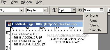
For best effects, they always look better in ALL CAPS.